I Need a Drink
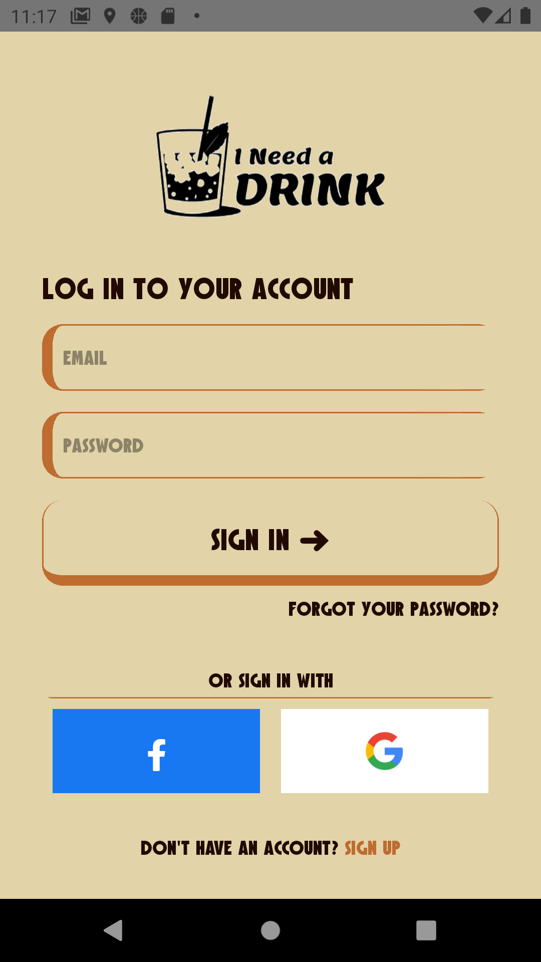
Technologies
React Native Redux Redux Thunk OAuth2 JavaScript ES6+ CSS NPM
Description
A mobile app with the goal of creating a social network based around users and their favourite bars and cocktails.
Developer's Comment
Currently in development.
Nexter
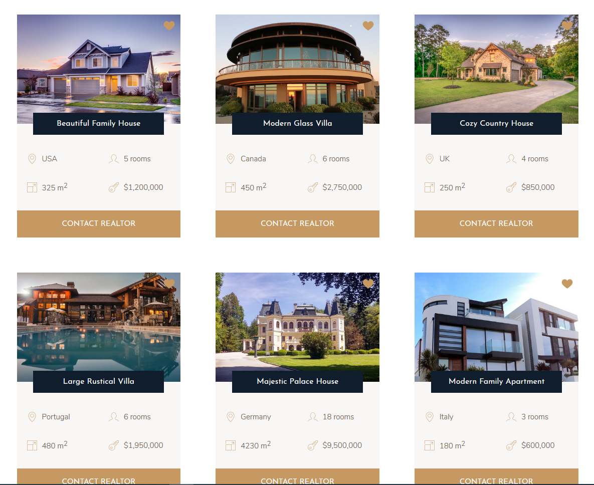
Technologies
HTML CSS SCSS NPM
Description
Nexter is a template for luxury homes and realtors.
Developer's Comment
While the Trillo project focused on utilizing Flexbox, the
Nexter project was solely dedicated on utilizing CSS's Grid
feature. I certainly know the pain of having to create
responsive grid layouts without Flexbox or CSS Grids. My
favourite part was a nifty trick you can do to create these
responsive grid tracks with the clever use of the minmax()
function along with autofit when defining your
grid-template-columns or grid-template-rows
Not only does this allow us to be flexible in displaying a
non-static number of columns/rows, but it is also responsive.
The auto-fit property creates as many tracks as possible given
a unit of size. It also collapses any leftover tracks and sets
the width to 0. Now when used with the minmax() function,
because of the minimum width, it will shift any tracks that
cannot fit in its current column/row into the next one. In the
case of leftover space, it is evenly distributed among the
tracks until the maximum width is reached, giving us the
"responsive" feel.
Special thanks to Jonas Schmedtmann for the design of the template and his fantastic course "Advanced CSS and Sass: Flexbox, Grid, Animations and More!" on Udemy
Trillo
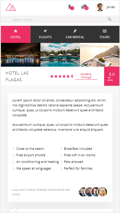
Technologies
HTML CSS SCSS NPM
Description
Trillo is a template for travel accomodations and services.
Developer's Comment
The purpose of this project was mainly to utilize CSS's
flexbox feature. After spending some time on it, I
instinctively felt the appropriate times to create flexbox
containers.
The theory behind it might take some time to get used to
especially remembering whether to use justify-content or
align-items, but I managed to beat it into my head that
justify-content deals with aligning elements on the main-axis
while align-items deals with aligning elements on the
cross-axis.
Heres another witty way of remembering it according to an
online stranger.
| draw a line to make a cross
A line, align, get it? (*Insert forced laughter). I think my favourite part of this project was when I realized how easy Flexbox could utilized in creating responsive layouts. For example, on desktop viewport sizes, you may want to set your flex container on a nav menu to be row but change it to column for tablet/phone with media queries. Its amazing!
Special thanks to Jonas Schmedtmann for the design of the template and his fantastic course "Advanced CSS and Sass: Flexbox, Grid, Animations and More!" on Udemy
Natours
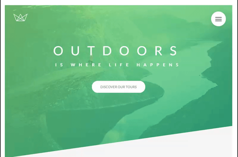
Technologies
HTML CSS SCSS NPM
Description
Natours is a template for nature themed tour reservations.
Developer's Comment
The purpose of the Natours project is to get deep into CSS. I already had an idea of how specificity works, but it was quite enlightening to learn what happens to CSS when we open up a website.
- HTML is loaded
- The HTML document is parsed into the DOM (Document Object Model)
- Meanwhile, CSS is loaded
- CSS is then parsed into the CSSOM (CSS Object Model) and the final values of each properties are resolved via. a detailed process called "The Cascade" (hence the 'C' in CSS)
- The DOM and the CSSOM form the "Render Tree"
- The browser then utilizes the "Visual Formatting Model" to render the page based off the "Render Tree"
- User sees final rendered website
I was also introduced to the 7-1 design pattern for organizing your .CSS files
- base/
- components/
- layout/
- pages
- themes/
- abstracts/
- vendors/
Finally, I got a chance to use a CSS proprocessor (SCSS in this case) and got to experience first hand some of the features missing from old school vanilla CSS such as variables and shorthand & notation. I also got a much better understanding of writing BEM (block__element--modifier) notation compared to my previous attempt at the Product Landing Page project.
Special thanks to Jonas Schmedtmann for the design of the template and his fantastic course "Advanced CSS and Sass: Flexbox, Grid, Animations and More!" on Udemy
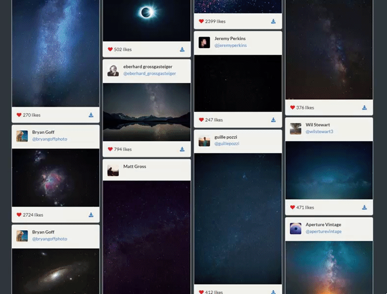
Photolytics
Technologies
ReactJS JavaScript ES6+ SemanticUI Animate.CSS Axios CSS NPM
Description
Photolytics is a web application that will aesthetically display images allows users to search for images and gain insight into the actions taken (i.e. views, likes, downloads)
Developer's Comment
Photolytics is something that I wanted to build ever since I
blundered pretty hard on that web development final project
during my college days. BUT, I feel that I managed to rectify
that failure here with this project.
I used SemanticUI to build my UI components since I wanted to
try something else aside from the widely known Bootstrap
framework. Although now having used it and a few other UI
frameworks, I can pretty much say they are all essentially the
same. The design of the cards were based off the posts from
Instagram while the waterfall grid layout was something
similar to imgur. Overall I was quite pleased with how the
waterfall layout and individual components turned out.
However, I was a bit disappointed with how much control I had
over implementing certain animations in ReactJS. For example,
I wanted to to play certain animations when components were
unmounted. Easy enough, with Animate.CSS, I will just append a
className to the component on the componentWillUnmount()
lifecycle method and it should work right? Well as you can
guess, this doesn't play out as intended since you can't
really play an animation on something that no longer exists
(who knew?). The solution here would be to delay the
unmounting until after the animation has finished playing.
For the image columns, I implemented a round-robin system to
distribute the images one at a time to each column. So when my
infinite pagination feature came around, it worked perfectly
to distribute the next series of images to each column.
Okay, well maybe not entirely perfectly, because with this
came another problem. Ironically in order to create the
"waterfall" layout, the height of each card needed to be
varying in size and while it worked nicely with my round-robin
distribution algorithm, you would get some cases where one
column would be much longer than the others. I guess maybe
next time, I'll allocate elements based on how much space each
column is occupying.
Product Landing Page
Technologies
HTML CSS
Description
A template for a generic landing page.
Developer's Comment
Stemming from the calculator project, I wanted to delve more
into CSS and research how it actually worked. In this project,
I applied CSS's flexbox feature to build various responsive
sections.
It was also at this point I was introduced to writing CSS in
BEM (block__element--modifier) notation and wanted to apply it
here as well. Although looking back, I got the syntax entirely
wrong as well as how you are suppose to name the "blocks" and
"elements". But at least I got the concept!
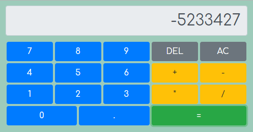
JavaScript Calculator
Technologies
ReactJS JavaScript ES6+ Bootstrap NPM
Description
A calculator.
Developer's Comment
Yes, I know that building a calculator is probably the
equivalent of your first year comp sci project. But the
purpose of this was to develop a solid understanding of how
state and property passing works between parent and child
components in ReactJS.
At this point, I was also getting curious about the blackbox
that was CSS. Not only did I want to code functionality behind
components, I also wanted to make them look visually
appealing. So I just started off with Flexbox since it seemed
like a clean way of getting beautifully spaced components up
and running. Bootstrap was a nice starting point since the
framework abstracts the need of writing CSS properties
behind the class names.
Random Quote Machine

Technologies
ReactJS JavaScript ES6+ Animate.css Axios NPM
Description
Random Quote Machine does exactly what it's name suggests. It generates a random quote and displays it.
Developer's Comment
I think this is the first ReactJS application I ever built. The purpose of which wasn't actually to build something complex, but rather see what the framework offered and conjure my own thoughts and opinions on it.
VRDuckHunt

Technologies
Unity3D C# VRTK
Description
VRDuckHunt is a virtual reality shooter with progressive level difficulty.
Developer's Comment
The rise of VR had coincidentally brought me together with a group of people who shared similar passions for game development including an incredibly talented modeler. The biggest challenge for me was making the gun behave and feel as immersive as possible. This included getting gyroscopic orientation to match the controller, animation, firing and of course--reloading.
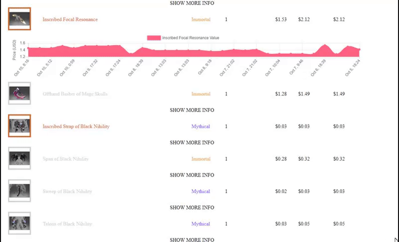
Playerbase
Technologies
HTML JavaScript ES5/ES6 NPM
Description
Playerbase does a lookup on a user's steam profile and gets their inventory data so it can display the market value for each item. In doing so, it also calculates the total value of your account based on ingame items.
Developer's Comment
I remember when I completed this, I felt pretty happy
considering how it was the first real web application that I
built using the new(er) ES6 standard. But there were a lot of
problems with it. For example, incomplete classes, giant
if-else blocks, incorrect implementation of Steam OAuth, and lack of styling.
Looking back now from 2020. I'd like to say that I came a long way from when I first started.